The wordmark, the two colours, the icon, the splash, and the store.
Part of the Konjo design language. The laws in the spine apply here unless this chapter contradicts them.
Everything else in this design language is about the product. This chapter is about the handful of surfaces where Konjo is presenting itself — a stranger's first two seconds, an icon on a home screen among forty others, a screenshot in a store listing. Different job, different rules, and until now no rules at all.
The name
Konjo is the public brand: user-facing strings, the App Store listing, the marketing site.
Mojo is the repo codename and appears nowhere a user can see. Some identifiers still carry
the pre-rebrand cuongnhu slug and scheme; those are plumbing, and the
rebrand checklist tracks them.
Cuong Nhu is the launch community, not the brand. Konjo is multi-style by design, and no brand surface should imply otherwise — no Cuong Nhu iconography in the icon, the splash, or store art.
The wordmark
KONJO set in Bebas Neue, all caps, loaded on demand with a system fallback so nothing
renders in an unregistered family.
KonjoWordmark is the only implementation.
Do not re-set the wordmark by hand; a wordmark typed in the app's body font is not the
wordmark.
- Bebas Neue is for the wordmark and nothing else. It is not a display face for headings —
the type scale's
statementanddisplayare. One typeface used for two jobs stops being a signature. - Never inside the app proper. The wordmark belongs on pre-account surfaces, the icon, the splash and marketing. A logo in a nav bar is a logo doing nothing: the person already knows which app they opened, and it costs the space a screen title would use.
- Clear space on all sides of at least the cap height. Never crowd it, never place it on a busy photograph, never outline it, never add a shadow.
The two colours
The brand is red and ink, and both have precise jobs — see colour.
brand.redis the fill. White on it is 5.01:1. It is the brand's presence, and on product surfaces it is spent once per screen as the red role.brand.inkis the ground. The near-black behind the wordmark, the Studio rail, the hero block in light mode.
Brand red is not a wash. A whole screen painted red is not more Konjo, it is less — the red only reads as brand when it is the loudest thing rather than the only thing. This is the single most likely way to get a brand surface wrong.
Never introduce a second red. There is one, and belt colours — including a red belt — are the dojo's data rather than the palette; see rank.
The app icon
assets/icon.png, with assets/adaptive-icon.png for Android's masked shape and
assets/notification-icon.png for the Android status bar. All three are generated from
assets/brand/ninja/head-mark.svg by
scripts/brand/icons.mjs; never edit the PNGs.
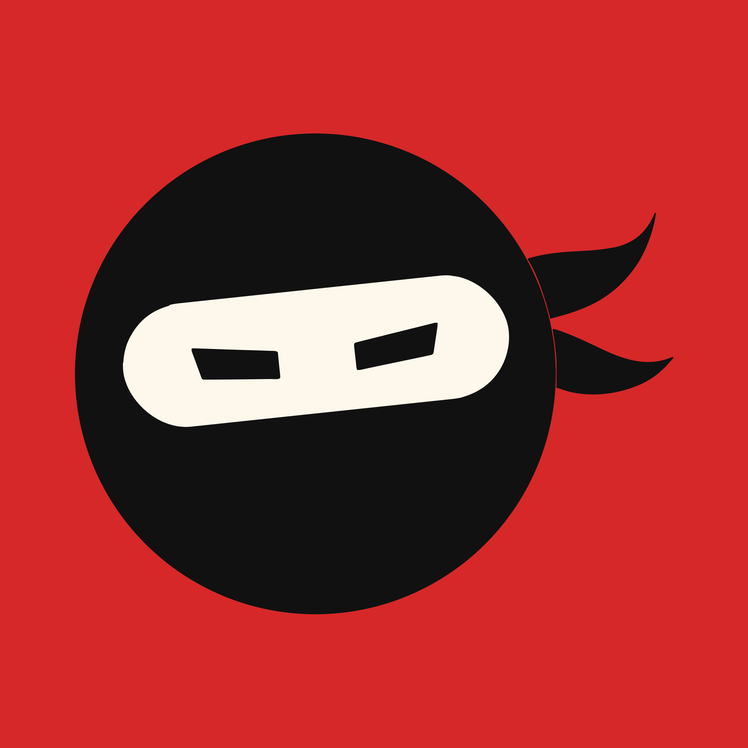
- The mark is the ninja head on brand red: the round hood, the band tilted −6°, the focused eyes and the two flying tails. No words; at 40pt a wordmark is illegible.
- Test it at 16, 29, 40 and 60pt before anything else. An icon designed at 1024 and never checked small is the most common icon mistake.
- The Android foreground sits inside the 66% safe circle, tail tips included. The generator frames it there.
- The notification icon is one colour. Android paints the status-bar icon as a silhouette, so a full-colour icon renders as a blank square. It is white, with the band cut out.
- No screenshot of the UI, no gradient, no drop shadow, no photograph. The same depth law applies here.
- It does not change with the theme. One icon.
The splash
assets/splash-icon.png on brand.red, resizeMode: contain.
The splash exists to cover a cold start, not to be looked at. Same mark as the icon, centred, on the flat brand fill — no tagline, no version, no loading copy, no spinner. If it is on screen long enough for someone to read something, the problem is the start-up time.
Its background is brand.red, currently hardcoded in app.json. That file cannot import from
the token package, so it is one of the few places the value is written by hand — which is
exactly why it needs saying here: if brand.red ever changes, app.json changes with it.
Store screenshots
The listing is the only design surface where someone decides whether to install at all.
- Real screens with real-looking data. Never a mockup of a screen that does not exist, and never a dojo with three students where the app promises a community.
- The first screenshot carries the strongest single idea, because most people see only that one.
- Caption above the device, in the brand voice — plain and direct, no exclamation marks, the same voice as the app. Text over the device image never.
- Light theme. Light is the surface Konjo is designed on and the one a stranger should meet first.
- Every screenshot passes the same contrast rules as the app. A store image is not exempt because it is marketing; it is the first accessibility impression the product makes.
- They go stale. apps/site/public/img/screens/ holds the marketing site's screenshots, captured by scripts/site/capture-screens.mjs — a band strip count that no longer matches, a section that no longer exists. A screenshot of a UI that shipped two redesigns ago is worse than none, because it is a promise the app breaks on first launch. Recapture them at each release gate.
The mascot
The ninja is both the mark and the mascot. Where it may and may not appear is in imagery; its canon and poses are in the ninja prompt pack. It never speaks.
Never
- A second red.
- Bebas Neue used as a heading face.
- The wordmark inside the app's chrome.
- Cuong Nhu iconography on a brand surface.
- Words in the app icon.
- A splash with a tagline or a spinner.
- Store screenshots showing screens that no longer exist.