Forty screens from the 46-app, 315-screenshot study behind the design language. Every file is a publicly published App Store marketing screenshot, kept here as internal design reference and credited to its publisher below. They are not Konjo assets and must never appear in Konjo's UI, marketing, or store listing.
Agents: open these. Read renders a .jpg and you will actually see it. When you have
built a screen, open the closest reference and find the specific difference in spacing,
weight, or ratio. "Roughly similar" is not the bar.
Ratings are App Store US at time of capture (2026-08-22) and are context, not proof — the calibration record explains where the evidence for each claim actually comes from.
Do not measure pixels off these files. They are downsampled, and several are keystoned marketing mockups rather than real screens. The adversarial review pass found individual measurements taken this way off by anywhere from 35% to 3×. Read them for mechanism — what is loudest, what order things appear in, what carries hierarchy — and take every number from Konjo's own tokens.
Athletic
The register Konjo lives in. Bold, high-contrast, one loud thing per screen.
| File | App | Publisher | Rating | What we take from it |
|---|---|---|---|---|
nike-run-club-02.jpg |
Nike Run Club: Running Coach | Nike, Inc | 4.77 / 417,580 | The hero ratio — the stat is decisively larger than the page title. Secondary stats packed left, value on top, label below. |
nike-run-club-01.jpg |
Nike Run Club: Running Coach | Nike, Inc | 4.77 / 417,580 | Loudness spent once — full-bleed photo, one display line, nothing else competing. |
whoop-03.jpg |
WHOOP | Whoop Incorporated | 4.80 / 65,693 | A single huge number against a small label; inset hairlines between metric rows. Airy for a data screen. |
whoop-02.jpg |
WHOOP | Whoop Incorporated | 4.80 / 65,693 | Uppercase micro-labels inside cards — the label treatment done at the right size. |
oura-01.jpg |
Oura | Oura Health Oy | 4.86 / 283,299 | Eyebrow -> hero -> body -> one pill button. The vertical rhythm we copy; the gradients we do not. |
strava-02.jpg |
Strava: Run, Bike, Walk | Strava Inc. | 4.81 / 369,177 | Activity row anatomy: author, title, stat row, media, social proof, actions. |
hevy-03.jpg |
Hevy - Workout Tracker Gym Log | Hevy Studios S.L. | 4.92 / 87,639 | Charts that stay legible at a glance. Konjo's analytics screens should look like this. |
runna-01.jpg |
Runna: Running Plans & Coach | Strava Inc. | 4.85 / 33,185 | Plan overview: dense structured data that still scans. Sport-tech numerals. |
apple-fitness-01.jpg |
Apple Fitness | Apple Inc. | 2.87 / 11,338 | One hero, then a little. Tonal cards, no shadows, icons as the only colour. |
ladder-01.jpg |
LADDER Strength Training Plans | Ladder Technologies, Inc. | 4.95 / 183,372 | Heavy condensed caps at full volume — the register Konjo's display type sits in. |
Craft and restraint
Where 'obviously easy to use' comes from. Type doing the work of boxes.
| File | App | Publisher | Rating | What we take from it |
|---|---|---|---|---|
things-3-01.jpg |
Things 3 | Cultured Code GmbH & Co. KG | 4.82 / 27,826 | Two type sizes on the whole screen. Grouping by ~12pt of extra space, not dividers. |
things-3-02.jpg |
Things 3 | Cultured Code GmbH & Co. KG | 4.82 / 27,826 | Dense but calm: compact rows carrying two lines of text. Section header plus a hairline. |
apple-health-01.jpg |
Apple Health | Apple Inc. | 3.02 / 8,866 | Tonal cards on a tinted page with NO shadow — the reference for our separation law. |
apple-health-02.jpg |
Apple Health | Apple Inc. | 3.02 / 8,866 | Inset hairlines and a 44pt icon gutter in a grouped list. |
flighty-01.jpg |
Flighty – Live Flight Tracker | Flighty LLC | 4.85 / 147,692 | Premium without ornament. Dark, dense, quiet. |
timepage-03.jpg |
Timepage: Calendar Planner | Bonobo Pte Ltd | 4.62 / 15,312 | Colour-blocked day view — how far editorial treatment can go before it stops being an app. |
structured-02.jpg |
Structured: Daily Planner Todo | unorderly GmbH | 4.79 / 164,446 | A timeline that reads instantly. Icon column, time, title. |
arc-search-01.jpg |
Arc Search — Find it, Faster | The Browser Company of New York Inc. | 4.88 / 24,790 | Two-word display type carrying an entire screen. |
Operational software people love
For Studio and the Teach tab: dense data kept calm.
| File | App | Publisher | Rating | What we take from it |
|---|---|---|---|---|
linear-01.jpg |
Linear Mobile | Linear Orbit, Inc. | 4.83 / 2,001 | The only colour on the whole screen is a 16px icon per row; text stays monochrome. Take that discipline, not its label casing — Linear sets section labels in sentence case, Konjo sets them in eyebrow caps, and that is a deliberate divergence from the founder's heavy-condensed-caps answer, not an oversight. |
linear-02.jpg |
Linear Mobile | Linear Orbit, Inc. | 4.83 / 2,001 | Zero divider lines in a dense inbox. Unread = weight + a dot, not a background. |
attio-04.jpg |
Attio | Attio Limited | 3.57 / 28 | A dense-list reference — not a Studio table target. It is a phone screenshot, and it carries vertical rules, which studio/tables.md forbids. Read it for row rhythm and column restraint only; Studio has no rendered table target yet: field-type icons in column headers, tight rows, 1px rules. |
attio-01.jpg |
Attio | Attio Limited | 3.57 / 28 | Kanban cards where every row is one field prefixed by a monochrome type icon. |
superhuman-03.jpg |
Superhuman Mail | SUPERHUMAN LABS INC. | 4.61 / 3,582 | Dimming background content with a flat colour wash instead of a scrim plus shadow. |
stripe-dashboard-02.jpg |
Stripe Dashboard | Stripe, LLC | 4.70 / 68,520 | Money shown calmly: status as coloured text rather than a badge, and a primary paired with a bordered secondary rather than stretched full-width. |
notion-01.jpg |
Notion: Notes, Tasks, AI | Notion Labs, Incorporated | 4.78 / 89,839 | An empty state that teaches rather than apologises. |
monarch-02.jpg |
Monarch: Budget & Track Money | Monarch Money, Inc. | 4.89 / 105,805 | Editorial serif headlines over sans body — the direction Konjo considered and rejected. |
Community, events, motivation
For Social, Events, and the progress mechanics.
| File | App | Publisher | Rating | What we take from it |
|---|---|---|---|---|
partiful-01.jpg |
Partiful: Party Invite Maker | Partiful Co. | 4.95 / 233,445 | Highest-rated app in the study (4.95 / 233k). User-authored titles left alone; date is the loudest metadata. |
partiful-05.jpg |
Partiful: Party Invite Maker | Partiful Co. | 4.95 / 233,445 | Social proof as overlapped avatars plus a plain count. Event row anatomy. |
luma-02.jpg |
Luma: Events & Invites | Luma Labs, Inc. | 4.94 / 17,040 | Event discovery that stays light. Category chips, clear time, no chrome. |
duolingo-02.jpg |
Duolingo: Language Lessons | Duolingo, Inc | 4.72 / 5,393,166 | The streak-and-badge mechanic Konjo adopts — and the tone it must not. |
letterboxd-02.jpg |
Letterboxd | Letterboxd Ltd | 4.82 / 88,269 | A profile built from what someone has done, not from a form they filled in. |
bereal-01.jpg |
BeReal: Photos & Friends Daily | BeReal | 4.77 / 1,154,144 | How a feed stays a feed and does not become a dashboard. |
Anti-patterns — the category we beat
Konjo's actual competitors. Study the mechanism, never the look.
| File | App | Publisher | Rating | What we take from it |
|---|---|---|---|---|
mindbody-03.jpg |
Mindbody: Fitness & Wellness | MINDBODY Inc. | 4.90 / 269,378 | INVERTED ROW ANATOMY: the timestamp is larger and above the class name. The eye lands on the wrong thing. |
mindbody-05.jpg |
Mindbody: Fitness & Wellness | MINDBODY Inc. | 4.90 / 269,378 | Four stacked metadata treatments per row; the primary action is the lowest-contrast element in it. |
mindbody-06.jpg |
Mindbody: Fitness & Wellness | MINDBODY Inc. | 4.90 / 269,378 | Selected state signalled only by a 3px underline in the same colour, weight, and size as unselected. |
zen-planner-01.jpg |
Zen Planner Member App | Daxko LLC | 4.58 / 7,373 | Gradient nav bar; three button styles in one row; two of four lines bold so they compete; an unexplained gold accent bar. |
zen-planner-02.jpg |
Zen Planner Member App | Daxko LLC | 4.58 / 7,373 | A centred title on a screen whose neighbour is entirely left-aligned. |
gymdesk-01.jpg |
Gymdesk - Members App | Martial Arts on Rails LLC | 3.69 / 45 | Teal-gradient cards and a chart nobody asked for, in place of an answer to 'what do I do now'. |
spark-member-01.jpg |
Spark Member | SPARK MEMBERSHIP LLC | 3.69 / 352 | Stock photography and clip art doing the job design should do. |
mystudio-01.jpg |
MyStudio App | MyStudio Academy LLC | 4.83 / 7,591 | Gradients, three competing accent colours, and no discernible hierarchy. |
Konjo target mockups
Not references — these are the target, built from Konjo's own tokens during the calibration. Open them before implementing the pattern they show.
| File | Pattern | Spec |
|---|---|---|
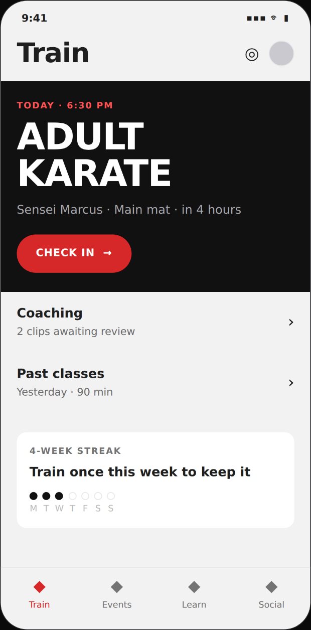
konjo/tab-home-hero-light.jpg |
Tab home, hero-led — full-bleed hero, quiet rows on the tinted page, one white tile | patterns/tab-home.md |
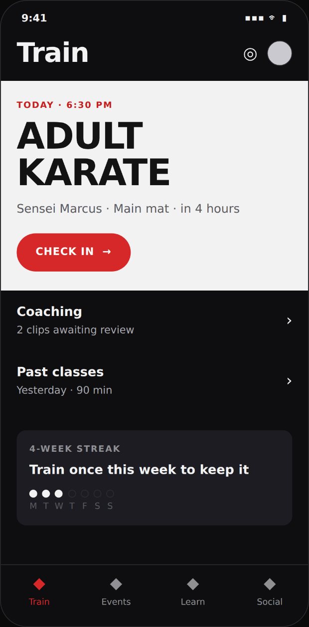
konjo/tab-home-hero-dark.jpg |
The same screen in dark. surface.hero inverts — the loud block is near-white here, because brand.ink on the dark page is 1.021:1 and would vanish |
foundations/colour.md |
konjo/tab-home-index-light.jpg |
Tab home, index-led — search first, one personal card, then the index. Zero loud blocks, zero red, zero filled primaries, all legal | patterns/tab-home.md |
konjo/tab-home-index-dark.jpg |
The same, dark. Card #1C1C22 on page #0E0E10 = 1.137:1 |
foundations/colour.md |
konjo/tile-grid-target.jpg |
Attendance tile grid with corner status glyphs | patterns/tab-home.md |
konjo/tile-grid-legend.jpg |
The six statuses, tiered | Skill, references/tokens.md |
konjo/promotion-certificate-target.jpg |
The promotion moment | patterns/celebration.md |


Konjo's own screens
Real shipped screenshots live at
apps/site/public/img/screens/, captured by
scripts/site/capture-screens.mjs. Look at those
before redesigning anything: most of the anti-patterns in
the skill's reference list
are visible in stale captures — re-run the capture script before citing any of them as current
evidence.
form-target-{light,dark}.jpg — added 2026-08
The form reference the set was missing. Thirty-three screens and not one form, while the skill's self-review step ends with "compare yours to the closest one" — for the most common screen type after the index and the detail, there was no closest one, and a blind test found that instruction was a dead end.
Unlike the other targets these are generated, not drawn:
node scripts/design/render-form-target.mjs renders them from
packages/design-tokens/tokens.ts, so the target cannot drift from the palette. Regenerate
after any token change.
What it shows: the tinted page with white inputs; the eyebrow-per-section grouping; the label
row with Optional marked (never Required); the select trigger in both its empty and
populated forms; a field in its error state; the repeating note group with a checkbox per
line, unchecked by default; the summary line naming the person; the consequence line
above the primary; and one filled primary with nothing else competing. Red appears once, as the
error, and the belt swatches carry their ring.
The copy is load-bearing and is not invented. The consequence line and the note-sharing model are quoted from product-facts.md. Do not paraphrase either from this image — read the source. An earlier version of this target carried a single free-text notes field, the helper "The student can read this", a consequence line that omitted the head instructor and correctability, and the placeholder "Choose the sensei" — which hardcodes one lineage's honorific into a screen every dojo sees. All four were wrong, and all four were persuasive precisely because they were rendered.
promotion-certificate-target.jpg — known deviations, do not copy them
This target was drawn before several rules existed, and a blind test found three places where copying it faithfully produces a defective screen. It is kept because its composition is right — the certificate as the one loud moment, the rank as the subject, the sensei named — but these three are wrong and the rules win:
| In the image | The rule | Which is right |
|---|---|---|
| "See what's next" is a full-width pill | patterns/buttons.md: "A full-width primary uses radius.input 8, not radius.pill — a full-width pill reads as a toy" |
the rule |
| The button and the link below it are centred, over empty page | SKILL.md, what never ships: "A centred button floating in a void" |
the rule |
| The date reads "8 November 2026" | foundations/content-format.md: a promotion date is absolute and formatted Nov 8, 2026 |
the rule |
A reference image is evidence about layout, not authority over the laws. Where an artefact and a chapter disagree, the chapter wins and the artefact gets a row in this table until it is redrawn.
studio-table-target.jpg — added 2026-08
The Studio reference the set was missing. Nine Konjo targets and every one was a phone, while the skill's self-review step says "compare yours to the closest one" — so for a Studio screen the closest thing on disk was a competitor's phone screenshot carrying vertical rules, which studio/tables.md bans.
Generated, like the form target: node scripts/design/render-studio-target.mjs --spec
renders it from packages/design-tokens/tokens.ts and
studio/metrics.md, so it cannot drift from the palette. Regenerate
after any token change.
What it shows: the 236px ink rail; the page frame at spacing.s32; a panel on the tinted page;
the toolbar with a search field, wrapping filter chips and the count; a 36pt header row in
eyebrow with the sorted caret; 46pt rows with the subject in rowTitle and everything else in
body; the belt swatch at swatchSize.roster with its border.control ring; and status as
pills rather than chips. No vertical rules, no zebra, no shadow.
It has a second job. --live renders the same markup against the real
apps/studio/globals.css, with the Tailwind at-rules stripped. Diffing that before and after a
stylesheet change is the only visual verification of Studio available without a running server,
and it is what the 171-declaration ramp migration was checked against.